Redesigning the top Navigation of Yocket Platform
Let me explain you the process of redesigning the top navigation bar of our Yocket Platform
About Yocket
Yocket is an Ed-tech company that provides a platform to help students who are interested in studying abroad. The company offers features and resources that make it easier for students to find universities, connect with fellow students, track their application progress and more. Overall, Yocket’s mission is to simplify the study abroad process and make it more accessible.
Team- 2 Designer (Me & Monika)
Project duration- 2 week
Why redesigning top navigation
On the current Yocket Navigation bar we have positioned our different product and services and we did some analysis after discussion with user(we interviewed 20 user who are using the different device to use yocket platform) and checked the analytics data on how are those touch points working in terms of signups.
Research Analysis (after discussion with 20 user)
1. Based on the analysis we have found theta few touch points( Scholarships, Test
prep and Course Guides) are not performing great from last few quarter.
2. The Navbar design also gets skewed on different screen sizes(low resolution size,
so we also need to fix those issues.
3. Although we have placed a lot of our services/features on the Navigation bar, we
still do not have a few important touch points there, like Education Loan and Forex
services . So we are also looking to add those touch points at the right places.
4. The grouping is quite old and interaction has been outdated now and not intuitive
to the user.
5. After discussion with user, we found that the discoverability of the specific
features like education loan, premium service and offers has been difficult.
Checked Analytics data
We did some analysis to understand the performance of the the touchpoint from the top navigation in terms of signups. We got to know some touch point which is performing best and some which is not bringing the enough clicks and signups.
High performing Touch point:
1.College Finder Click
2. Feed Click
3. Country Guide
4. Explore Click
5. Connect Click
Low performing Touch point:
1. Scholarships
2. University bachelors course
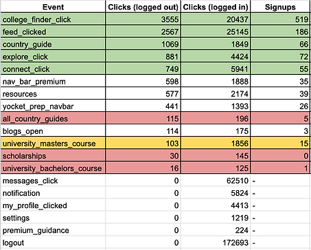
Performance of the Yocket top navigation touchpoint
Understanding the problem space
After through analysis of the current navbar, we identified some design related pissue which need to be solved for sure in this redesign.
1. Top Navbar getting skewed in low resolution screen

2. Explore and Resource dropdown looks very text have and not interactive


3. Navigation and main page getting skewed if left side panel is open
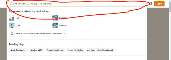
4. Search bar is opening in full screen and reducing the visibility and accessibility of the other touchpoint in the navbar
5. Difficult to find the major offering like Education loan, Kickstarter, scholarship and Forex services
Key Principle to be followed while redesigning
I have followed these design principles to create the yocket website navigation menu which is both easy to use and visually appealing.
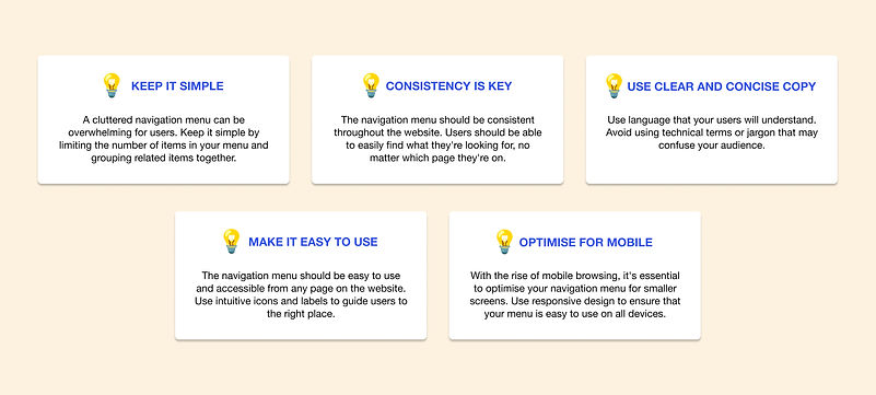
design principle
Paper mockups and Iterations
Initially while having multiple round of discussion with the internal stakeholders regarding the grouping and positioning of the new feature and removing new feature we have drawn few ideas on paper regarding layout, grouping and interactive dropdown which engage user and provide maximum touchpoint in less space.
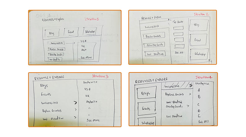
Paper mockups
Add design system, component and ineractive elemtn ideas and exploration
Visual Design
We have created the simple, clean and easy to use design which solve the the current problem of discoverability. Also we have tried to keep the UI style consistent with our design system and other product Yocket Prep. We have used the on hover interaction to make it look interactive and aesthetically attractive.
1. Grouping the product touchpoint logically and making it interactive
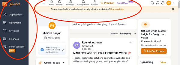
One of the bigger challenge was to add the 3 new touchpoint which all was important from the customer acquisition and conversion point of view. we can't keep all of them upfront in the navbar so we decided to make one separate menu called "Product" and kept all the major product offering like Education Loan, Kickstarter, Yocket Prep and Forex Services.

Product tab interation
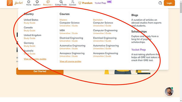
2. Grouping Explore and Resource
From research and internal stakeholder discussion, we found that the explore section and resources menu have been used to find the college, courses, guide and deadline which seems similar and relevant if we can group under one umbrella then it will be very easier for user to find all the info at one place under one menu. And it will help us minimise the number of item in top navigation.

Explore and Resource Tab
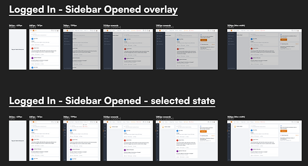
3. New Interaction for Hamburger menu for left side panel
We have realised that from the through observation and discussion that the interaction on hamburger menu for opening left side panel, which was changing the yocket logo and menu was getting skewed for low resolution devices. So we have changed the interaction of menu icon clicks in a way that it will not disturb the width of the menu and will not distort the design.

Hamburger Menu Interaction
4. Interactive On hover Interaction to grab user attention
One of the research observation was that the all the menu dropdown menu was very static and not interactive at all and was not engaging user much on the platform. So we decided to have the subtle on hover interaction on some card to grab the user attention and pleasing experience for user after exploring the inspiration from trending interaction for menu design.


On Hover Interaction
5. Wring better UX copy to communicate user clearly
Currently we have used the long, lengthy and complicated UX copy for menu name and subtext under menu dropdown. we decided to write more shorter copy like Home> Feed, Top Universities and Top courses to make it simple and clear.
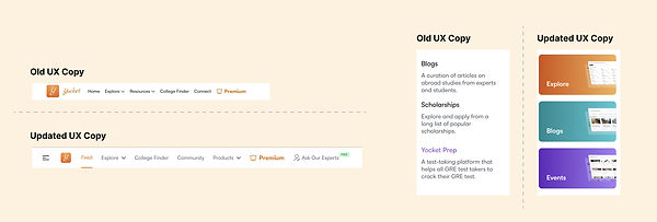
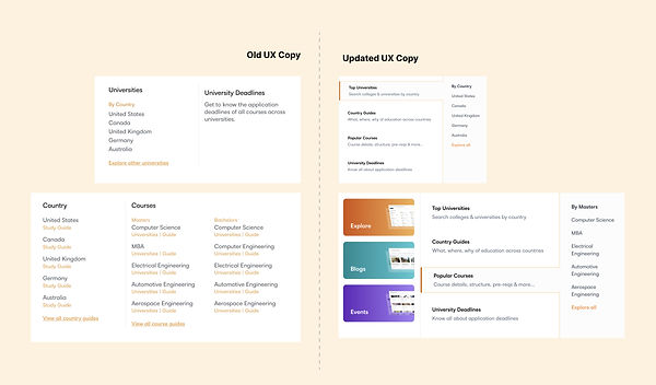
UX Copy
6. Optimising menu for low resolution devices
In current design, one of the bigger challenge was to that it was getting skewed for lower resolution devices and design variation was not created for all the possible low resolution devices. we discussed all the possible scenario for all the possible low resolution devices and created design for that and reducing the logo interaction we were saving a lot of spaces.
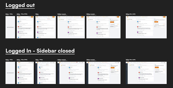
Design for all resolution screen